How many times have we heard, “the artwork sells the shirt”? And while most of us know this to be true, do we really run our business based on this principle? I see too many shops sacrifice artwork due to time, budget or other constraints and — in my opinion — miss opportunities to set themselves apart from the competition and increase sales. I often hear my seminar attendees say, “I would love to do better designs, but my customers aren’t asking for that kind of artwork.” My answer to that is, “That’s because they don’t know you can do it.”
 Providing upgraded or enhanced versions of artwork starts a conversation that allows you to hold your price or even increase it. Most customers are used to calling around and getting pricing from everyone: “How much is it going to cost me for a full-front, two-color design printed on 72 shirts?” If you’re a screen printer, most will think “Well, that’s a job using clip art with a color thrown in.” That’s exactly what everyone else is going to do.
The easiest way to differentiate yourself is with better artwork. It doesn’t cost extra for the same two screens if one design is created using regular clip art and the other is created using enhanced stock art. Two colors equal two screens.
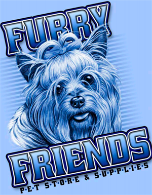
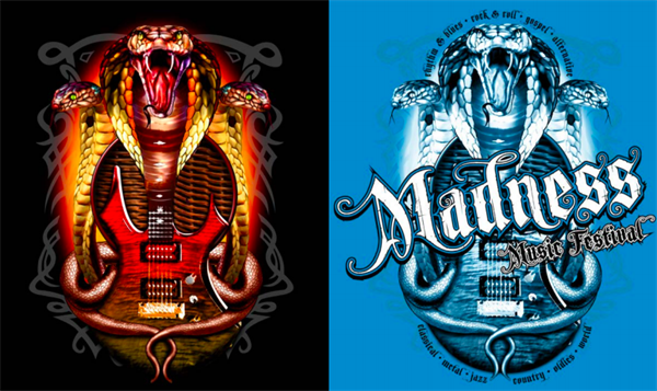
If you show customers a two-color design that has some tonal value to it or possibly with halftones, showing highlights and shadows, they will want to go with the nicer-looking art. Customers are unable to visualize complexities on their own, but if you can show them, they will want it.
If you have a customer you print shirts for, create samples of other products they might need. If it’s a team, make a sample jacket, hat or gym bag. If it’s a yoga studio, think of leggings, mats or water bottles. If you decorate the products yourself in-house instead of outsourcing them, make an actual sample product. A customer who always gets screen printed T-shirts might not be aware you also offer vinyl cutting or dye sublimation. By creating and displaying sample products using other methods, you’re opening a whole new avenue of possible sales. Whenever possible, I always advocate for doing at least one sample specific to prospective clients.
 Most customers are also used to the traditional left chest or full front or back layouts. Showing examples of other placement options or special effects — some of which won’t increase the cost — opens up their minds to a variety of new possibilities and establishes you as the source for new, fresh ideas.
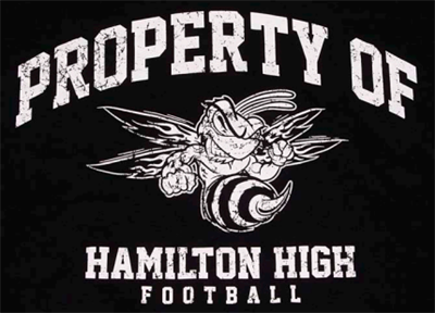
 Create a series of samples to show the same artwork done in different styles and techniques to show various finished looks. Examples include one-color distressed, one-color discharge spatter, two-color, three-color, full-color and special effects, such as images with high density and foils and special effect inks or gels. Create a reflective logo heat printed for visibility at night. Make things pop. Showcase your arsenal of art, design, printing and production possibilities, and give customers a reason to want to add to their prints.
If you show something that’s not exactly what customers are looking for now, you never know if they may need something similar in the future. If they see you can provide it, they don’t have to look elsewhere. Having good relationships with customers is a good way to keep them coming back.
Read the full article on SGIA.org.


